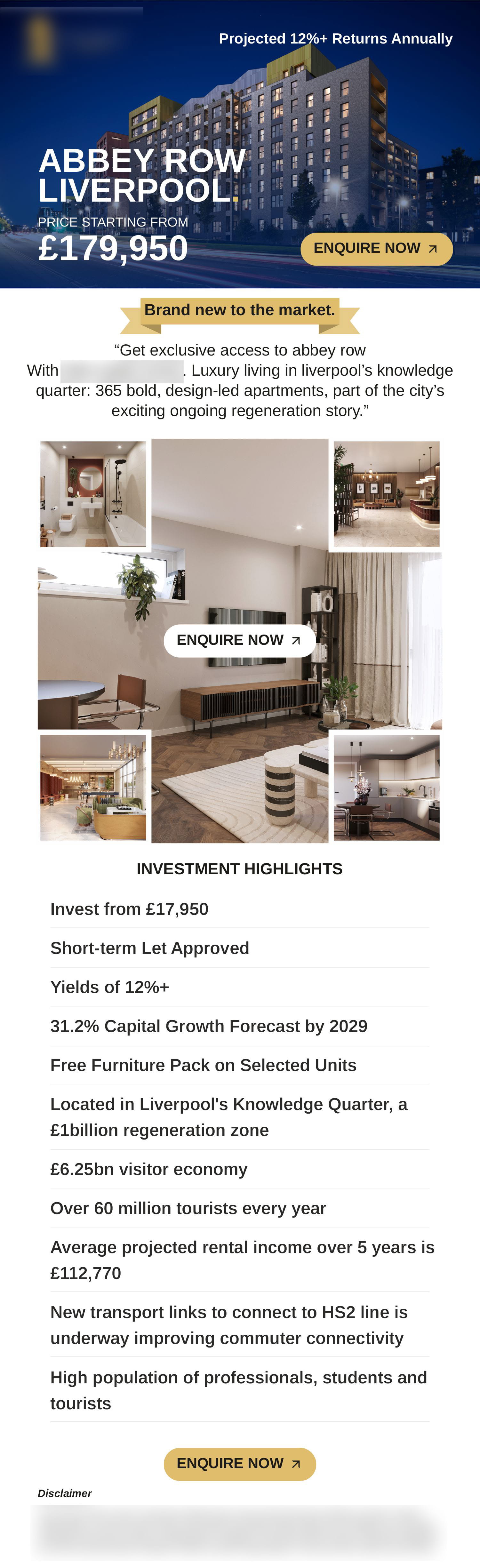
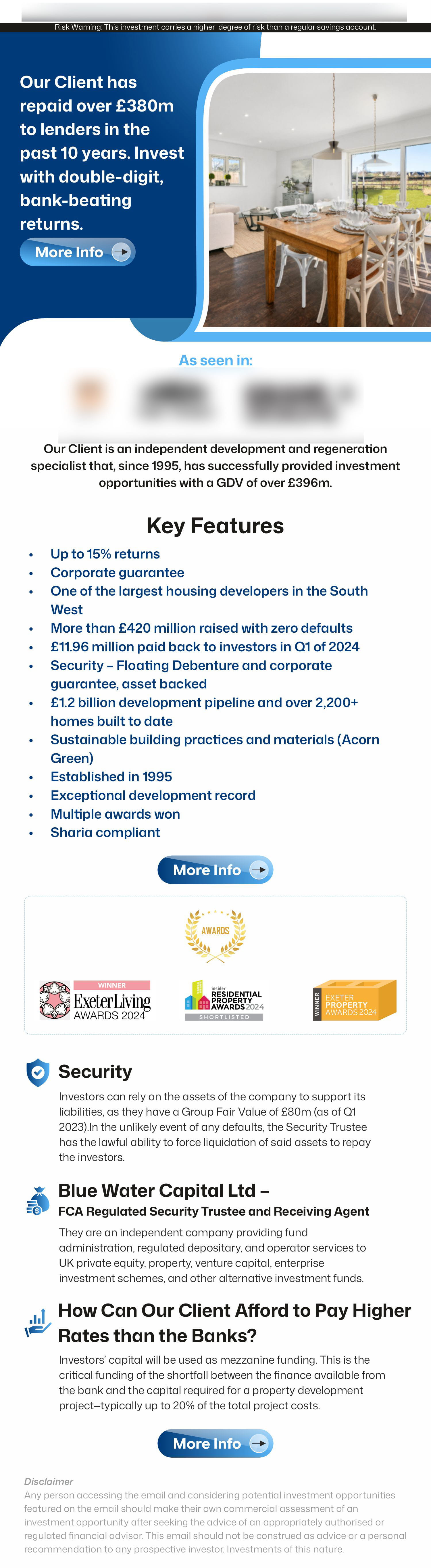
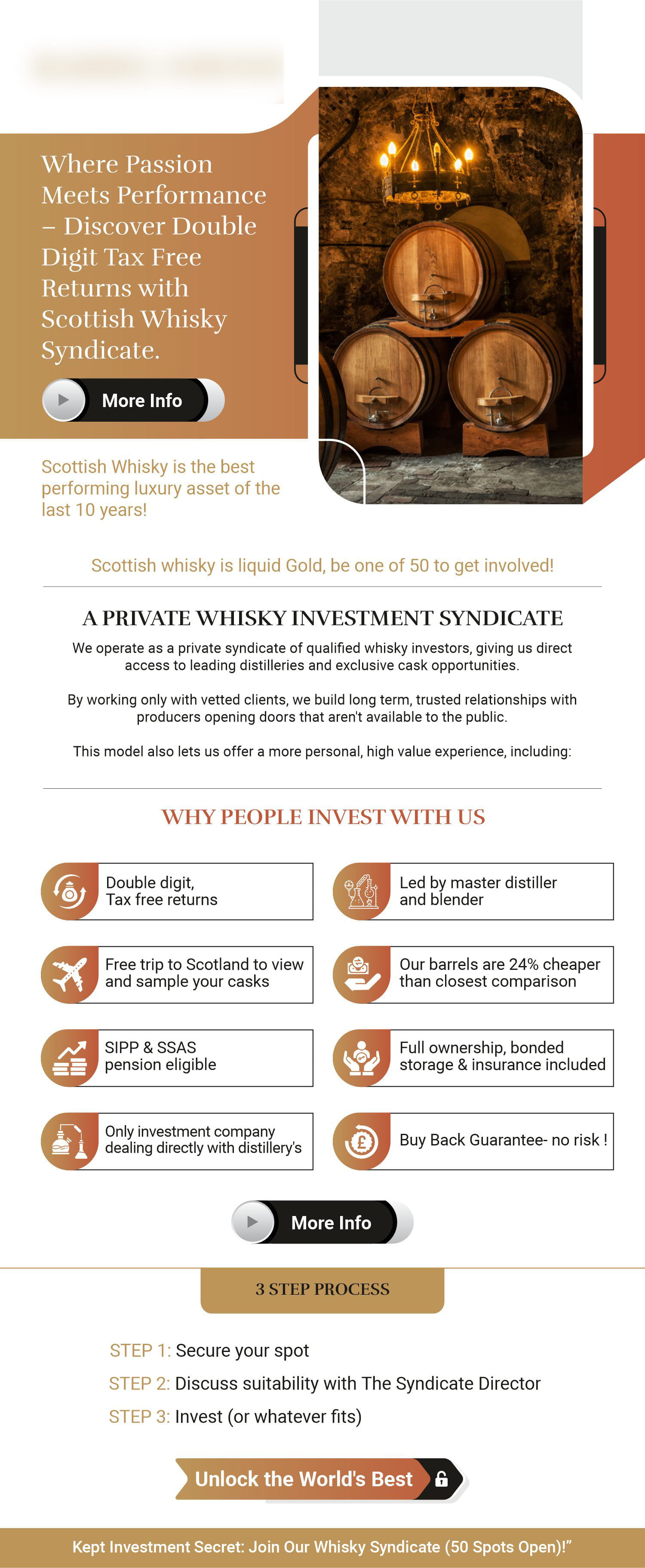
Flyer design is the layout of a single-sheet promotional piece — printed or digital — intended to communicate one offer, event or message quickly to someone who has not asked for it.
What Is Flyer Design?
A flyer is interruption, not invitation. Nobody sits down to read one. It is handed over, posted through a door, pinned to a board, or scrolled past, and it has perhaps two seconds to earn more. Everything in the design follows from that: one message, one action, type that can be read without being brought closer, and contrast strong enough to survive poor lighting or a cluttered noticeboard.
Why Most Flyers Fail
The usual failure is not ugliness — it is crowding. A flyer carrying four offers communicates none of them. Adding a second headline halves the first one. Filling the margins to "use the space" removes the very thing that makes the message visible. A flyer that says one thing clearly will always outperform one that says five things quietly, and the hardest part of the work is usually deciding what to leave out.
Formats and Sizes
A6 is cheap to print in volume and suits handouts and door drops. A5 is the common middle ground for events and offers, big enough for a photograph and a short block of detail. DL fits a standard envelope and a leaflet rack. A4 gives room for a menu or a price list but costs more to produce and is less likely to be carried away. The right size depends on how the flyer reaches people, which is worth settling before the design starts.
Print Setup and Digital Versions
Printed flyers need bleed, safe margins, CMYK colour and images at print resolution — the same discipline as any press work. Most campaigns now also need the flyer as a square or portrait image for social media, as an email attachment, and sometimes as a web banner. These are different crops and often different type sizes, not the same file exported twice. We produce the print artwork and the digital sizes together so the campaign looks like one campaign.
Working With What You Have
Flyers often come with a deadline attached. If you already have brand colours, a logo and photography, we work within them. If the copy is still a rough list of points, we tighten it into a headline and a short supporting line as part of the layout, and show you where a detail is doing more harm than good.

 Flyer